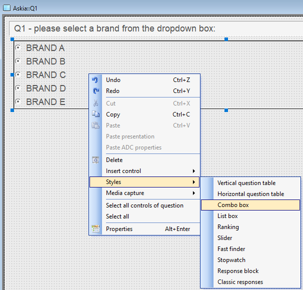
Customizing the combo box/dropdown control in AskiaDesign
| Summary | This article demonstrates how to customize your combo box/dropdown controls |
| Applies to | AskiaDesign & web screens |
| Written for | Survey scripters & web designers |
| Keywords | design ; web ; screens ; script ; css ; combo box ; dropdown ; customize ; text ; arrow ; ascii |
See attached 5.4.9 example QEX.
In this article, we'll demonstrate the following:
1) Change the default text that appears inside the combo box.
2) Change the size (or remove) the "------>" arrow that appears inside the combo box.
3) Style the combo box with CSS.
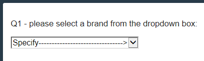
Changing the default text that appears inside of the combo box
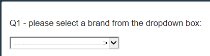
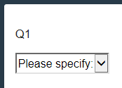
When you first start using the combo box, you'll notice that by default, it uses the following "Specify" text:
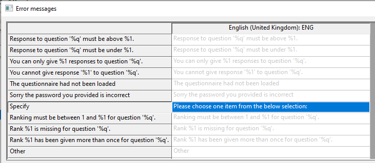
In order to change this, you will need to go into "Question mode > Edit > Error messages > Specify", and insert your custom combo box text here:
Change the size (or remove) the arrow that appears inside the combo box
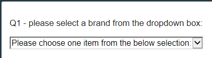
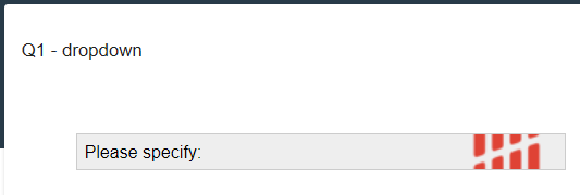
If you go back into "Question mode > Edit > Error messages > Specify" and insert " " (to not show any text on the combo box), you'll notice AskiaDesign still auto-generates an ASCII "-------->" arrow:

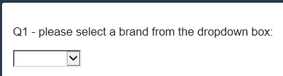
In order to fully remove the ASCII arrow from the combo box, you need to go into the response block properties of the combo box, into the "Edits" tab, and set the "Columns" value to anything between "1" to "7":
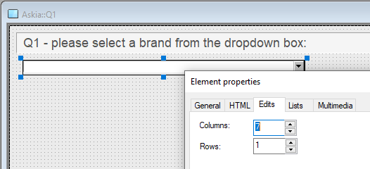
A value higher than "7" will show the ASCII arrow - the higher the value, the longer the arrow.
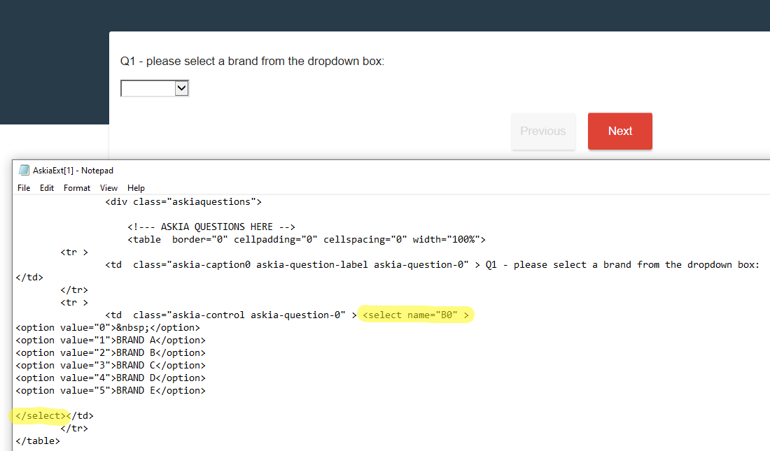
Style the combo box with CSS
In the background code, the combo box is basic <select> HTML, which means you can style it anyway you'd like via CSS:
Below are a few examples of styling it via <style> script in a label on the screen.
Example 1
Please note: every browser/device renders HTML differently, and the <select> HTML code is no different. In this example, I'm dynamically styling the combo box based on what browser is rendering the page.
<style>
@media screen and (-webkit-min-device-pixel-ratio:0) { /*safari and chrome*/
 select {
 height:30px;
 line-height:30px;
 background:#f4f4f4;
 }
}
select::-moz-focus-inner { /*Remove button padding in FF*/
 border: 0;
 padding: 0;
}
@-moz-document url-prefix() { /* targets Firefox only */
 select {
 padding: 15px 0!important;
 }
}
@media screen\0 { /* IE Hacks: targets IE 8, 9 and 10 */
 select {
 height:30px;
 line-height:30px;
 }
}
</style>
This code simply allows you to adjust the height of the combo box, but you're welcome to change the width, background colours, font, etc.
Example 2
In this example, I'm fully styling the combo box and also including a background favicon image.
<style>
select {
 margin: 50px;
 width: 450px;
 padding: 5px 35px 5px 5px;
 font-size: 16px;
 border: 1px solid #ccc;
 height: 34px;
 -webkit-appearance: none;
 -moz-appearance: none;
 appearance: none;
 background: url(https://askia.com/favicon.ico) 95% / 15% no-repeat #eee;
}

/* CAUTION: IE hackery ahead */
select::-ms-expand {
 display: none; /* remove default arrow on ie10 and ie11 */
}

/* target Internet Explorer 9 to undo the custom arrow */
@media screen and (min-width:0\0) {
 select {
 background:none\9;
 padding: 5px\9;
 }
}
</style>
Attached is a 5.4.9 example QEX that contains both CSS scripts.