Highlight row and column grid table headers on cell mouseover
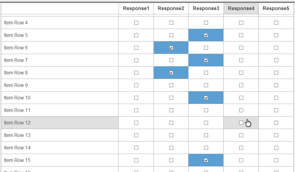
| Summary | This article describes how to highlight your header row and column in your grid table on mouseover, so when you hover on a cell of the grid, the corresponding row and column header will be highlighted, in AskiaDesign by using JavaScript/jQuery. |
| Applies to | AskiaDesign |
| Written for | Scriptwriters and survey authors |
| Keywords | header; grid; row; column; script; javascript; jquery; design; askiadesign |
- Download the HoverGridColor.zip file here and you will find the jQuery script files inside.
- To access a live demo, it's here.
How it works
Two .js file attached to the QEX:
- jquery.fixedtableheader-1-0-2.min.js
- jquery-migrate-1.2.1.js
Please make sure to insert these .js files in your QEX file in the Resources tab of the screen mode. Check your test path is set correctly (empty) so you can test it locally.
In your responseblock table add a class "gridhover" in the table tag and a class "gridhoverresponse" in the cell property of the responseblock properties.
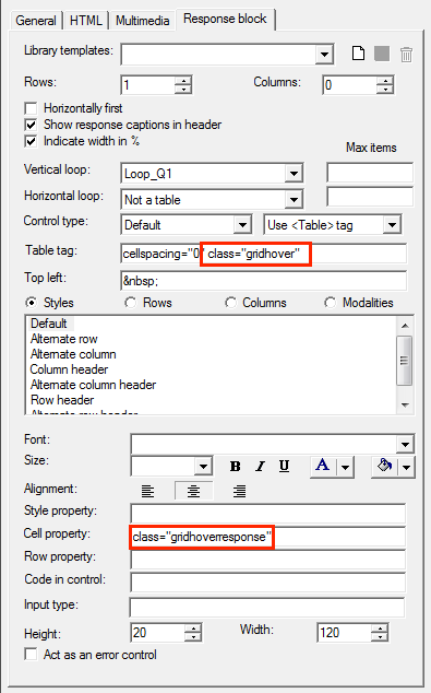
Add a class "gridhoverrow" in Row 1 and a class "gridhovercolumn" in Column 1 of the responseblock properties.
At the bottom of the page on the screen, add a label with the following script:
<script type="text/javascript" src="??ResPath??jquery.fixedtableheader-1-0-2.min.js"></script>
<script type="text/javascript" src="??ResPath??jquery-migrate-1.2.1.js"></script>
<style type="text/css">
.gridhover {
	width: 100%;
}
.gridhoverresponse, .gridhoverrow, .gridhovercolumn {
	background-color: #ffffff;
	color: #555555;
	font-size: 1.0em;
	margin-bottom: 0px;
	padding: 10px;
	text-decoration: none;
	border: 1px solid #a1a7ad;
	-webkit-border-radius: 2px;
	-moz-border-radius: 2px;
	border-radius: 2px;
	transition: all ease-in-out .4s;
}
 .gridhoverresponse:hover {
	background-color: #e0e0e0;
	cursor:pointer;
}
.hover {
	background-color: #e0e0e0;
}
</style>

<script type="text/javascript">
$(document).ready(function() {

	id_tableau= ".gridhover" ;
	/*table format*/
	$(id_tableau).find("tr:first").wrap("<thead>");
	$(id_tableau).find("thead:first").prependTo($(id_tableau));
	$(id_tableau).find("tr:first td").each(function(){
	contenttd = $(this).html();
	widthtd = $(this).width();
	classtd = $(this).attr("class");
	styletd = $(this).attr("style");
	idtd = $(this).attr("id");
	$(this).replaceWith("<th width='" + widthtd + "' class='" + classtd + "' style='" + styletd + "' id='" + idtd + "'>" + contenttd + "</th>");
	});
	$(id_tableau).fixedtableheader();


	$('.gridhover .gridhoverresponse').on('mouseover mouseout', function(){
                	 $(this).prevAll(".gridhovercolumn").addBack()
                 	.add($("#fixedtableheader0 tr")
                 	.children(':nth-child(' + ($(this).index() + 1) + ')')).toggleClass('hover');
		$(this).add($(".gridhover tr:first")
                 	.children(':nth-child(' + ($(this).index() + 1) + ')')).toggleClass('hover');
          	});

	function colorGridhoverResponse(){

		$(".gridhoverresponse:has(input)").each(function(e) {
			var selectedInput;
			selectedInput = 0;
			$(this).find("input").each(function(e) {
				if ($(this).is(":checked")) {
					selectedInput = 1;
				}
			});

			if (selectedInput == 1) {
				$(this).css("background-color","#5ca0d3");
			} else {
				$(this).css("background-color","");
			}
		});

	}

	$(".gridhoverresponse").click(function(){
		colorGridhoverResponse();
    	});

	$(".gridhoverresponse span").click(function() {
		colorGridhoverResponse();
 	});

	$(".gridhoverresponse input").click(function(event) {
		colorGridhoverResponse();
 	});

	colorGridhoverResponse();

});
</script>
You can change the colours used directly in the code of the label, it's in the style and the script and it's defined as a hexadecimal code.