Introduction to ADPs and Themes
Note: Themes are available in 5.4.4+, whereas ADPs are available in 5.4.6+
Introduction
ADPs (Askia Design Pages) are a new responsive survey layout model Askia has developed where all values (padding, font size, border, width, etc.) are set in relative units (such as rem and em). It also stores your “theme” colours, all of which can be referenced dynamically with the new Theme AskiaScript keyword (either in your ADCs or CSS templates).
Below is a .gif that demonstrates how easy it is to apply and style an entire survey using the new ADP templates:
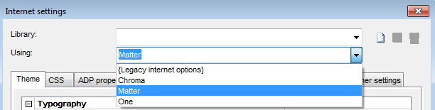
As you can see, by simply choosing the ADP "Matter" template, my entire survey can now be dynamically styled and controlled easily through either the "Theme" or "ADP properties" tabs in the Internet Settings.
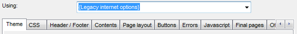
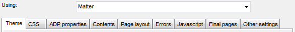
The new "Using" dropdown box contains three free-to-use ADP controls (Chroma, Matter, and One), or to continue using the legacy internet option template. See below:
When an ADP control is selected, the "Header/Footer" tab is replaced with the "ADP properties" tab:
ADP Controls and how they look
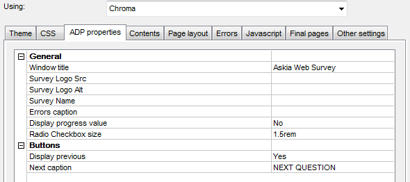
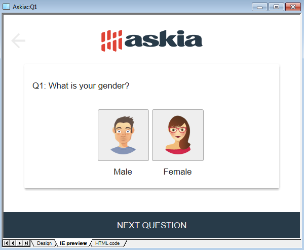
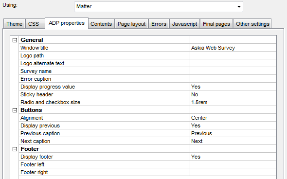
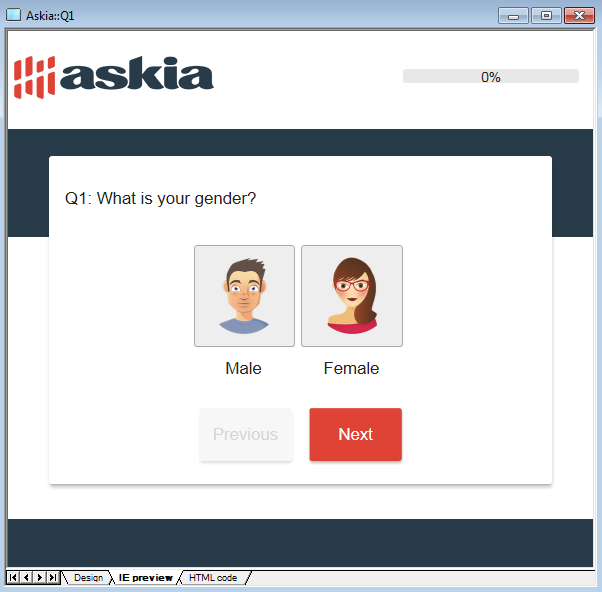
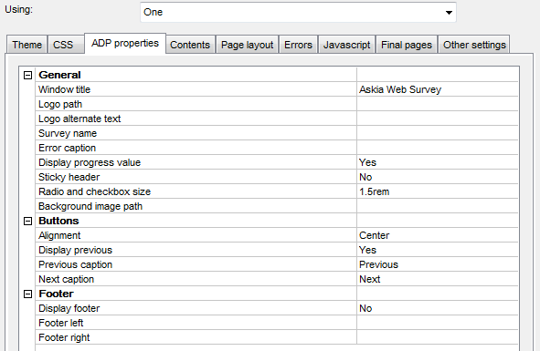
Below are the current ADP settings available to you for the "Chroma", "Matter", and "One" controls and how each of them appears.
Chroma
Matter
One

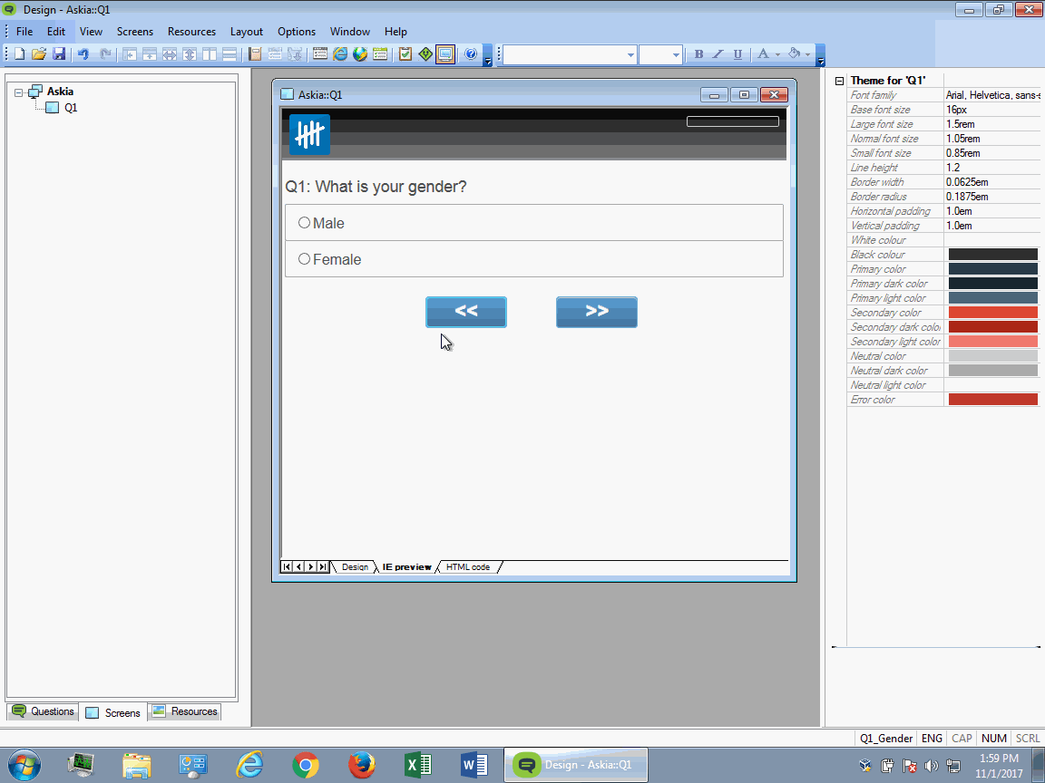
Theme
Theme-compatible ADCs, and Screens:
Introduced in 5.4.4, we have a new "Theme" tab in the "Internet Settings" window:
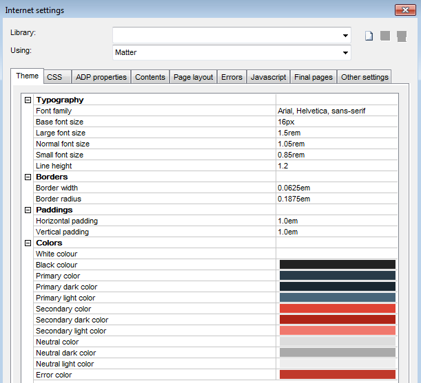
This tab stores colours, line heights, text sizes, paddings, etc., which can all be referenced in the survey by the ADP or ADC controls.
Reminder: you can find all of our latest 5.3.5 and 5.4.4 ADCs in the following GitHub directory: https://github.com/AskiaADX/default-adxs
The "Basic" branch contains all of the latest 5.3.5 compatible ADCs, where the "Themed" branch contains all of the latest 5.4.4+ compatible ADCs.
The "Themed" ADCs are rightly named so due to their designed way of utilizing the new ADP Theme properties found in Design's Internet Options.
All of the properties shown in the "Theme" tab are being referenced dynamically in all of the new "Themed" ADCs by using our new "Theme" keyword.
e.g. {%=Theme.PrimaryColor%} or {%=Theme.LineHeight%} or {%=Theme.BorderWidth%} etc.
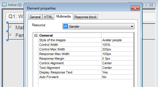
Let's take a look at the Themed 5.4.4+ Gender ADC in Design 5.4.6. By default, you will no longer see the advanced ADC settings, as you can see below:
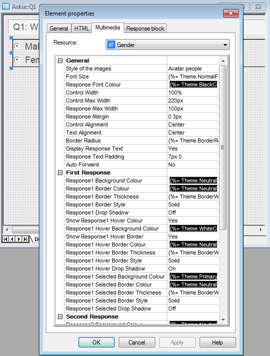
In order to enable the viewing of the advanced ADC settings, you need to enable the "Show extended properties for ADC/ADP" option:

Once enabled, you should now see the advanced ADC settings some of you may be familiar with:
FAQ
Can I change the theme colours? Can I change them only for a specific screen? What about changing them for a specific ADC?
The answer to all of these questions is YES.
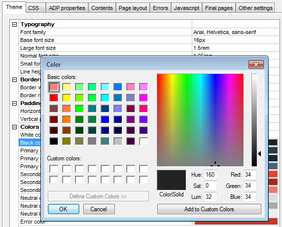
You can easily change the survey colours globally by changing them in the "Internet Options > Theme" tab; simply double-click on one of the colour options and the colour template window should appear:
You can also change them per screen by navigating to the right-side settings once a screen has been opened:

Let's take a look at the 5.4.4+ Gender ADC properties:
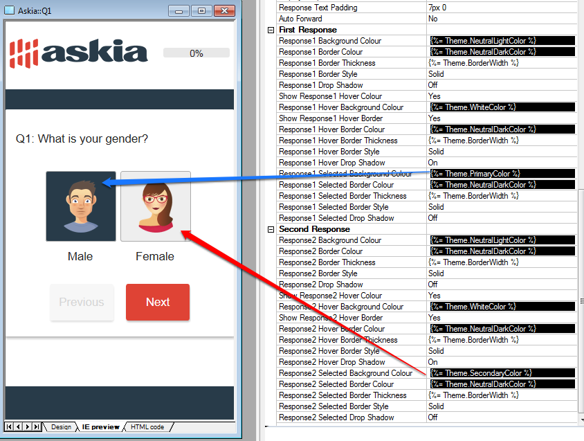
I can see that my first selected response in this ADC is using the "Primary Color," and my second selected response is using the "Secondary Color".
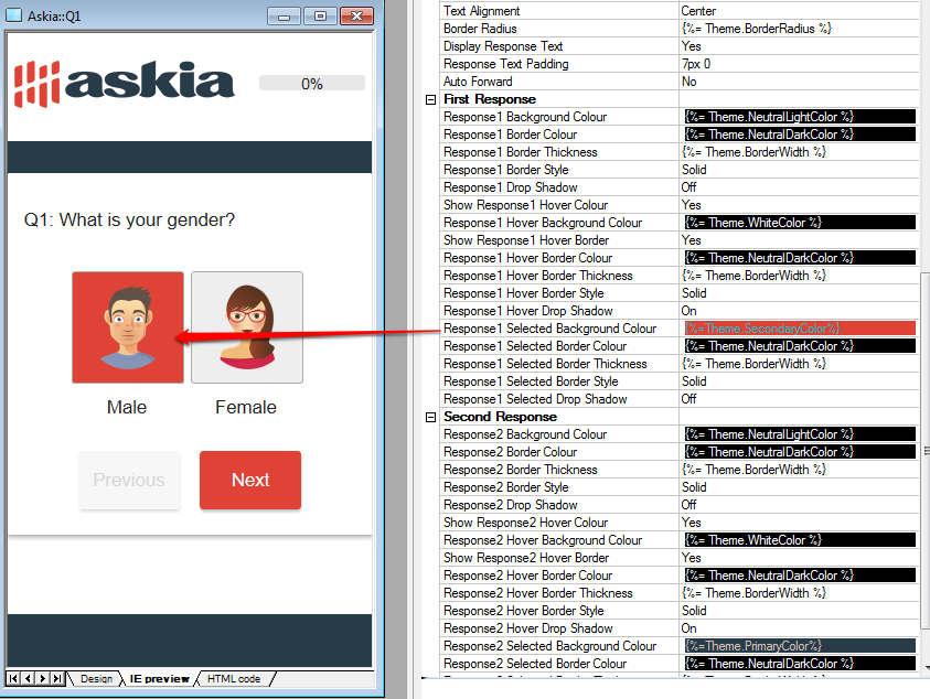
If I no longer want my first selected response to use the "Primary Color", I can manually choose a different color:
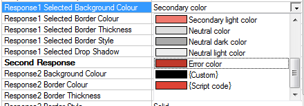
In this example, instead of using the "Primary Color" as my first response's background, I want to use the "Secondary Color" instead:
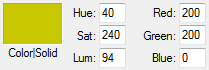
You also have the option of using a colour which hasn't been set in your Theme by using the {Custom} colour option and choosing your own RGB value:

If I used an RGB value of a dark yellow (200, 200, 0), I can see my changes reflected in my first selected response:

Are the older 5.3.5 "adc2" ADCs compatible with 5.4.6+?
Yes; all older versions of the ADCs are forwards compatible. That said, we highly recommend using the newer 5.4.4+ theme-compatible ADCs if you're using Design 5.4.4 or above.
If you use one of the older adc2 ADCs found in the "Basic" GitHub branch, they will not be automatically compatible with the newer APD Theme settings.
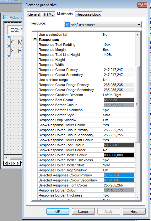
For example, if I use the latest adc2-statements ADC on my gender question, it will not follow any of my ADP Theme settings, as it is following its own {Custom} RGB theme settings, found in the normal ADC properties window:
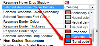
However, because we're using 5.4.6 Design, we now have the option of using one of the newer "Theme" colours from the dropdown list, or using a "script code" colour:
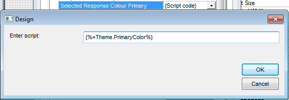
Here I can use the new "Theme" keyword in a script, like so:
Reminder to all developers:
We highly encourage the use of our ADX Studio to manually modify, test, validate, and build any existing ADC or ADP files.
If you extract the contents of a .adc or .adp file into its own folder, you can open that folder as a "Project" in ADX Studio and start modifying these to your own needs:
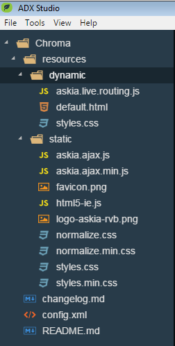
Above is the folder structure of the new "Chroma" ADP template.
Create an ADP
The latest ADX Studio can be found here: https://github.com/AskiaADX/ADXStudio.
If there are any questions using ADPs, Themes, or ADCs, please email us at support@askia.com.